Logo Creation
In 2008 Shire Transition Committee members worked closely together to choose from several different designs by three artists from the Papulu Apparr-Kari Aboriginal Corporation in Tennant Creek.
The logistics for creating and selecting a logo was extremely difficult simply because of the sheer size of the region, but a design called Tracks of the Barkly by Barbara Whippy using the previous smaller community councils’ logos captured the spirit of the region.
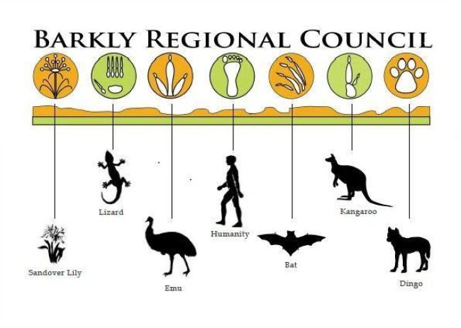
For the committee members a footprint has no colour and humanity has to be there. They felt that there were these visual tracks right across the Barkly region, which referred to a diversity of people living in the Barkly over time: Indigenous, non-Indigenous, miners, and those men and women working in the cattle industry.
The base line for the logo is the “McDouall Ranges” north of Tennant Creek, named by John McDouall Stuart on Tuesday, 5th June, 1860. This was in honour of Colonel James McDouall, of the 2nd Life Guards, Logan and Wigtownshire.
Locally they are known as the “Honeymoon Ranges” so called by the newlyweds camping on their mining leases in the range during the 1930s gold rush.
Above, there is a row of symbols starting with the Sandover Lily which represents the Urapuntja or Utopia region, the Lizard which symbolises Nyinkka, a sacred symbol in Tennant Creek, and Emu which characterises Elliott and the surrounding region.
The footprint in the centre represents humanity – all of the people of the Barkly – with the Bat representing Alpurrurulam, Kangaroo characterising Ampilatwatja and Dingo a sacred symbol for Ali Curung.
The Tracks of the Barkly logo shows that Barkly Regional Council as represented by the Council laws are listening to the communities and to the people of this vast remote region, not only with their intellects but with their hearts.

